


Spiff Up Your Print Project with These Font Tips
When designing a new advertising piece, most companies focus on crafting a targeted message and creating a vibrant, eye-catching design. However, the real impact of an advertising piece is lost when the target audience finds it difficult to read.
That’s why it is important to choose a font that is not only easy to read, but helps tie the design of a print project together. Here are a few tips business owners can follow to get the most out their print marketing projects.
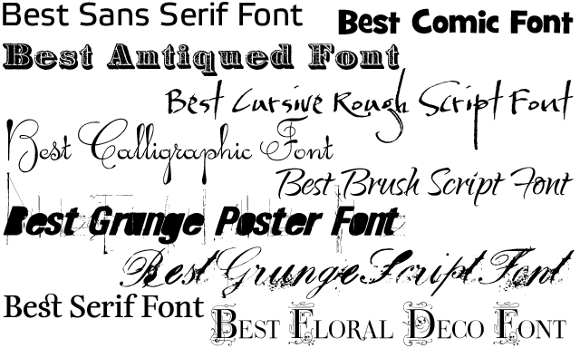
Serif Versus Sans Serif
A serif is a short line attached to the ends of letters in certain fonts, such as Times New Roman. Serifs make text easier to read because they help the eye tell the difference between letters in a large section of text. Use serif fonts for projects where there is a paragraph or more of text, such as a welcome letter or brochure.
Sans serif fonts are fonts where no serifs are used on the ends of letters, such as Arial. While they can be difficult and tiring to read in longer bodies of writing, sans serif fonts are visually bold and are good choices for headlines, logos, and other text that needs to catch readers’ eyes.
Just One to Three Fonts Will Do
Using too many fonts can crowd an advertising design and turn people off from reading it. Most effective print pieces employ only one to three fonts. Choosing one font is simple and helps tie an advertising piece together, while using two or three fonts can help build contrast between different kinds of text, such as headlines and call-out quotes.
Color and Contrast
The color of the text and the contrast this color creates with the background hue are also important considerations. Black and white are obvious choices for the best contrast. Black text on white background is a traditional choice, while white text on a black background is actually easier to read for those who struggle with sight.
Other colors can be incorporated into text under certain circumstances. Colored text is not the best choice for the main text of an advertising piece because it can be difficult to read; instead, companies should stick with black text. Colored fonts can be used to highlight certain text, such as a headline or call-out.
Font Size
Lastly, companies should carefully consider the size of the text on their marketing materials. For projects like a postcard, flyer, or brochure, text should be at least 16 pt and ideally 18 pt. While these sizes may seem large to those used to the standard 12 pt used in word processing documents, the larger font helps ensure that all recipients will be able to easily read marketing messaging.
After following these simple tips, send your marketing project to Matreks, your Twin Cities digital printer. Matreks meets all of your paper, color, and graphic needs to produce a stunning end-product. To learn more, contact Matreks today at 952-746-4010.
 Roland DG Signals Strategic Expansion into Industrial Digital Printing
 Hederman Brothers Breaks Ground on 20K-Square-Foot Expansion to Meet Growing Demand
 Sponsor Content
Komori: Inkjet is a 'High Value-Added Process'
Sponsor Content
Komori: Inkjet is a 'High Value-Added Process'
 Jessica DeCola on Mental Health and Printing
Jessica DeCola on Mental Health and Printing
Jessica DeCola on Mental Health and Printing