


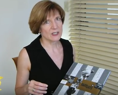
PaperSpecsGallery.com Presents: Skate Away the Days (Video)

 "Making a dummy is key to success for any book." — Bill Kennedy, AMP Printing
It always seems a little vulgar when big business dips its tentacles into a subculture, particularly one as grounded in youthful rebellion as skateboarding. Yet by most accounts Adidas Skateboarding — a line of footwear and apparel designed by skateboarders for skateboarders — gets it, promoting the sport as vigorously as it does its shorts, sneakers and tees. It’s an approach that’s been smartly carried over to the companion book for “Away Days,” a full-length film featuring the grinds, ollies and other breakneck maneuvers of Adidas’ global skateboarding team.
Crafted by Juice Design as one component of a larger cross-media promotional campaign for the film, the 124-page book looks like it was cut right out of the steaming asphalt of a hot city street thanks to the dramatic cover image reproduced from a shot by the book’s photographer, Sem Rubio. Printed offset on 100 lb. Pacesetter Silk Text by AMP Printing and mounted to 98 pt. chipboard, the cover comes magically to life with the application of a golden belly band that not only offers the name of and key images from inside the book, but also enhances the cover image by separating the skateboarder from his shadow.
Like Adidas’ approach to skateboarding, Juice Design, which followed the skate team around for three years as part of the “Away Days” project, knows when to step aside and simply let the images do the heavy lifting, running them large and beautiful with only a bit of text to frame the event. In lesser hands we’d be overwhelmed by a graffiti-style typeface wielded by an art director trying to be “down with the kids.”
“The designer holds true to the photographer,” observes AMP Printing’s Bill Kennedy. “Sem loves dark images and captures unbelievable shots that don't look real. Tory (Ford), who designed the book, worked with the printer to create a design that worked well with the printing process.”
Part of that entailed reproducing “these rich images using a touch plate to achieve super deep blacks while maintaining the subtle highlights,” Bill explains.
Overall, this book is a good reminder that sometimes the best design advice, like the best advice for dealing with a skateboarder coming at you full bore, is simply to get out of the way…and let the images tell your story.
Sabine Lenz is the founder of PaperSpecs.com, the first online paper database and community specifically designed for paper specifiers.
Growing up in Germany, Sabine started her design career in Frankfurt, before moving to Australia and then the United States. She has worked on design projects ranging from corporate identities to major road shows and product launches. From start-ups to Fortune 500 companies, her list of clients included Oracle, Sun Microsystems, Deutsche Bank, IBM and KPMG.
Seeing designers struggle worldwide to stay current with new papers and paper trends inspired Sabine to create PaperSpecs, an independent and comprehensive Web-based paper database and weekly e-newsletter. She is also a speaker on paper issues and the paper industry. Some refer to her lovingly as the "paper queen" who combines her passion for this wonderful substrate called paper with a hands-on approach to sharing her knowledge.


