


Designing Emails that Customers Love to Open
The best way to maintain excitement is to have a thorough understanding about audiences and what they care about. Content is also vital to success. And when done right, design can engage readers so they open your emails today and well into the future. Here are seven tips to create effective email designs:
1. Choose email dimensions appropriate for the viewing devices
Emails can be vertical or horizontal but must have correct proportions. If vertical emails stretch beyond 600 pixels in width, then viewers have to scroll from side-to-side to read them, which could easily turn them off and create negative brand perceptions. People like to scan text and focus on what they believe to be important. For that reason, left columns gets more attention right columns in vertical emails.
On the other hand, horizontal emails are image-based and favored by B2C more than B2B companies. The side scrolling layout breaks convention. As a result, the quality of navigational cues and product images determines if your emails frustrate or delight viewers.
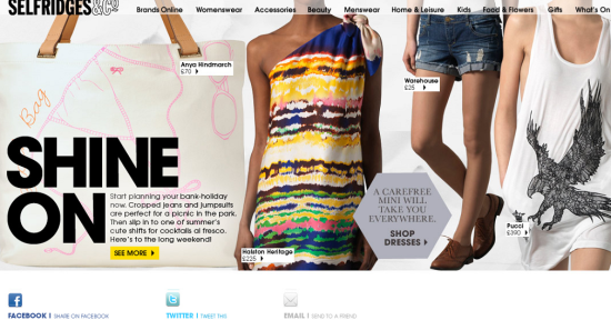
The Selfridges & Co. email design is 2000 pixels wide. The height is increased from 536 pixels to 716 pixels to accommodate social media links in the footer, but the main content is still around 550 pixels in height.
The maximum horizontal scroll in Outlook 2007 is 2110 pixels.
2. Design emails for mobile viewers
With the dramatic rise in mobile sales, it’s no surprise that email consumption on mobile devices is following a similar trend. MailChimp reports that more than half of mobile users in Japan read email on their devices, while the percentage is around 40% in the U.S.
The chart represents percentages of people worldwide who read email on their mobile devices.
According to statistics shared by Return Path Year-over-year (March 2011 to March 2012), email opens on mobile devices grew 82.4% and the views on mobile are likely to surpass both desktop and webmail by midyear.
63% of Americans and 41% of Europeans would either close or delete emails not optimized for mobile. Most smartphone email clients display content at 320 pixels to 480 pixels wide. If your email designs are wider than this, then you should consider using responsive designs to ensure optimal readability of your emails on smartphones.
3. Make your calls-to-action easy to find and click
Since the majority of your email subscribers do not scroll beyond the first screen of their desktops, it’s best to help them act immediately with clear calls-to-action high up in your newsletters or promotional emails. Reduce the number of such buttons to increase focus on a select few. For mobile-sensitized emails, increase the size of call-to-action buttons to decrease the time and effort required to reach them. Big buttons are not only more visible on mobile screens; they’re also easier to interact with. Thumb-friendly size for buttons is at least 46 pixels squared. Also, it is best to avoid a bunch of links in close proximity, as this makes selecting the proper ones difficult on small screens.
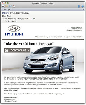
A national auto dealer group implemented responsive email design and increased its email open rate by 6.7 percent and click-through rate by 1.2 percent across all devices. With one-tap-direct-dialing, the dealer experienced hundreds of additional phone calls, an 18 percent increase in service appointments scheduled online, and engaged users through the maps and directions call to action, bringing in more business to the service drive—all in just one month!
4. Plan your core message without images
Unfortunately, images are not the most effective way to engage with your subscribers. Images are blocked by default for a majority of email clients. For that reason, you should feature your core message, headings and promotions in text to successfully convey them even if the images are blocked by your subscribers’ email servers.
5. Design with multiple content blocks to differentiate
Multiple content blocks can be used for newsletters to share more than one call-to-action in your emails. This could mean having different promotions running side-by-side or leading viewers to different news stories, blog posts or internal company events. The goal of this busier email template is to provide multiple options to readers to choose stories or links they would like to read. This type of wire-frame is useful if you have a lot of content to share in less space.
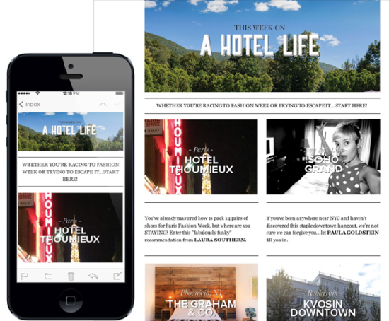
Founders of the travel site, A Hotel Life, use Sendicate to distribute their site newsletters with multiple content columns that include interesting articles and stories with their readers.
6. Use standard fonts
To view the fonts you’ve chosen, recipients of your emails need to have the fonts you used on their computer. As subscribers will inevitably have different fonts installed, it’s crucial to focus on a standard group that is the default on most computers, such as Arial, Verdana, Georgia, etc. Pick fonts (two or three, at max) that work with and preserve your brand integrity. Then you can get creative with font sizes, weights, colors and placement. Keep it simple and smart!
This template used by Charlie Pratt is a good example of how clean designs can work wonders. With a simple header graphic in striking colors, Charlie communicates to readers who he is and what he does effectively and then lists his services and latest blog posts.
7. Be Original
You can get inspiration from top brands and designers but it pays to be original. Try different designs and techniques to see what works best for your clients. Customers remember emails that tell stories, connect with their aspirations and above all, sound sincere in their claims. If you complement these attributes with simple but distinct designs, you can have the basis for long and fruitful relationships.
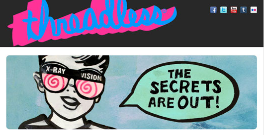
The Threadless newsletter is anything but dull. The design reinforces what their company stands for and their message.
What other tactics do you apply to make your email designs interesting and effective?
*/


