


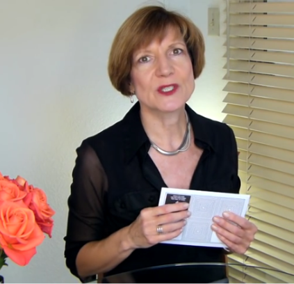
PaperSpecsGallery.com Presents: Public Art Fund Spring Benefit 2016 (Video)

 "We love that it feels simple and complicated at the same time. The highlight is certainly the laser diecut that animates the pattern and the type." — Denise Sommer, Ahoy Studios
A grocery list carved into a giant granite slab. An up-ended swimming pool titled “Van Gogh’s Ear.” New York City’s Public Art Fund more than lives up to its mission of “mounting ambitious free exhibitions,” and naturally wanted Ahoy Studios to convey that same ambitious flavor in the invitation they designed for its spring fund-raising event this year.
“Their annual fund raiser has a different theme every year,” explains Ahoy Studios’ Denise Sommer. “This year it was op art.”
We should explain that is “op” as in “optical illusion,” but less “Magic Eye” paintings and more squares, zigzags and spirals — hence the crazy triangle-square pattern you encounter on the envelope. But the true vision-bending experience awaits you within.
Much of what makes the 3-panel tri-fold invitation inside so effective is simply the fact that you’re not expecting it, which sums up the Public Art Fund’s attitude perfectly.
Through a laser-cut cover you glimpse the words “Public Art Fund Spring Benefit” and the event date. Open it up slowly and it seems as though the words and underlying pattern are in motion. It is only after you’ve opened it completely that you discover the wording is actually stamped in black foil against the triangle-square pattern first glimpsed on the envelope. Open the stamped flap to reveal the invitation itself printed, as is the rest of the piece, on Domtar Cougar Smooth 100 lb. Cover. {Get Swatchbook} A vellum sheet within lists committee members and artists, its green hue offering a nice contrast to the black and white invitation.
“The biggest challenge was the printing budget,” Denise admits. “We wanted to create movement by layering a diecut cover over a black and white pattern. At first we had designed it as a card that pulled out of a sleeve. Since that was cost prohibitive we came up with a diecut tri-fold instead.”
Sabine Lenz is the founder of PaperSpecs.com, the first online paper database and community specifically designed for paper specifiers.
Growing up in Germany, Sabine started her design career in Frankfurt, before moving to Australia and then the United States. She has worked on design projects ranging from corporate identities to major road shows and product launches. From start-ups to Fortune 500 companies, her list of clients included Oracle, Sun Microsystems, Deutsche Bank, IBM and KPMG.
Seeing designers struggle worldwide to stay current with new papers and paper trends inspired Sabine to create PaperSpecs, an independent and comprehensive Web-based paper database and weekly e-newsletter. She is also a speaker on paper issues and the paper industry. Some refer to her lovingly as the "paper queen" who combines her passion for this wonderful substrate called paper with a hands-on approach to sharing her knowledge.


